.png)
.png)
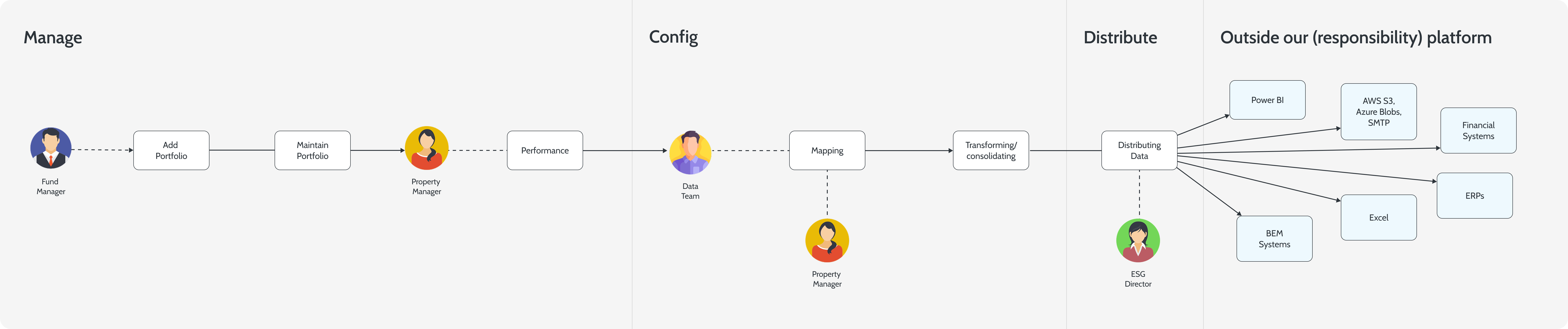
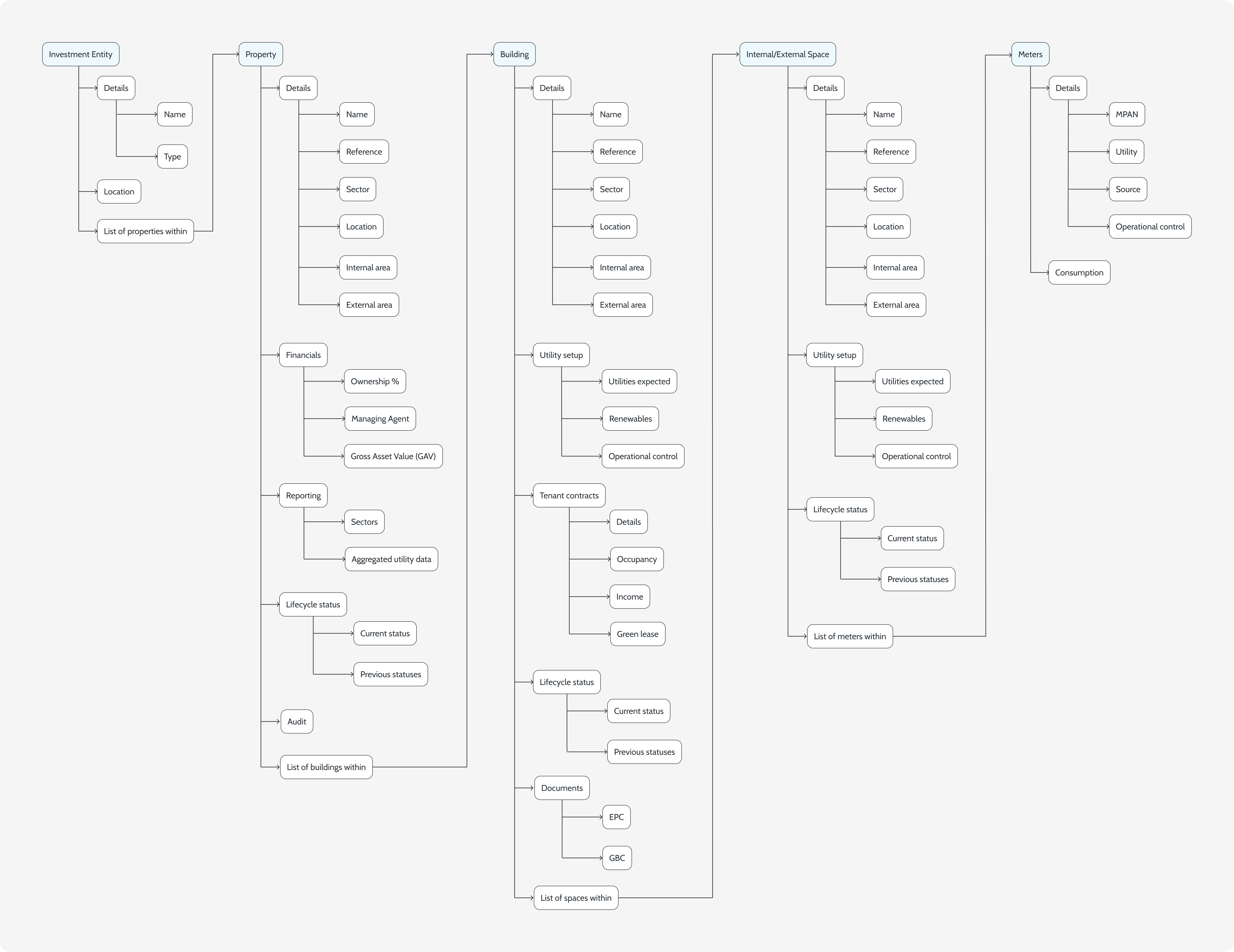
Information architecture
A portfolio as it actually exists
The hierarchy renders in the nav, in the URLs, in the breadcrumbs and in the data-quality roll-up. One model, surfaced everywhere it matters.
1
2
3
Portfolio
Lumina Capital3 funds
Lumina Core Fund32
Metropolitan12
Exchange House4 spaces
Ground floor3 meters
Floors 1–42 meters
G-1 main electric
Broadgate Tower6 spaces
14A Broadgate3 spaces
Trafford Point4
Lumina Capital▸Core Fund▸Metropolitan▸Exchange House
Exchange House
Assets
1
building
Gross area
18,400
m²
Spaces
4
child entities
Status
Active
since 2018
Data quality · rolled up
What you're looking at
1
Five strict levels. Fund, property, building, space, meter. Every entity declares its parent at creation time and the tree is the only way to navigate.
2
The URL is the path. The breadcrumb mirrors the hierarchy exactly, so any view in the platform is shareable as a link that names its scope.
3
Health rolls up. Coverage, completeness and freshness collapse from the leaves into a single bar at every level above. Noisy meters never disappear into a clean fund average.