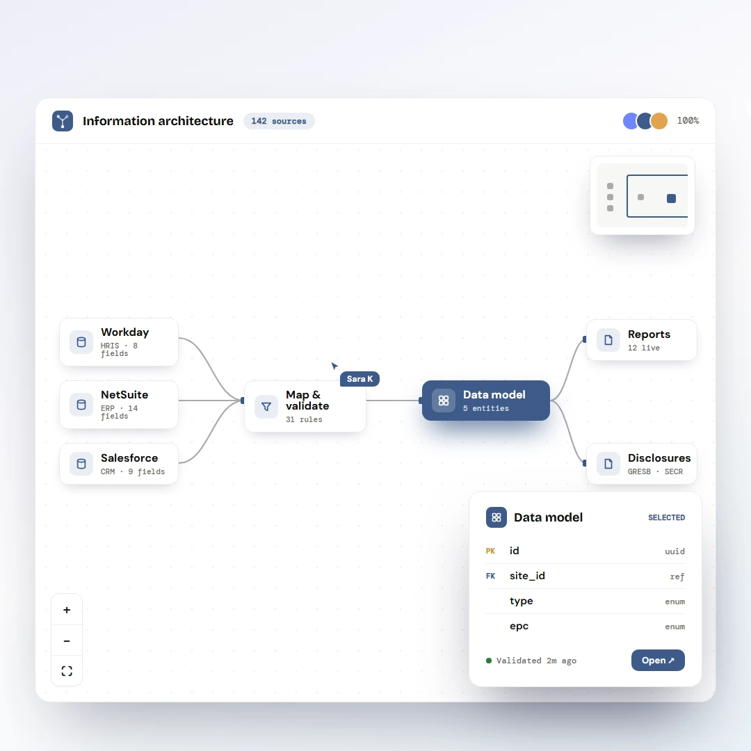
HOME ABOUT

Kova

ESG intelligence platform turning raw portfolio data into the answers fund managers were actually asking.

kova / Metropolitan Holdings / overview

Client
Thornfield Energy
Pseudonyms used for confidentiality
Timeline
2023 – 2024
~7 months
Role
Lead Product Designer
End-to-end, research to delivery
Team
Design lead (me) 1 UX Researcher 1 Product Manager 3–4 Engineers

The brief

Thornfield's ESG platform held energy and carbon data across 32 assets, but the analytics layer surfaced numbers without meaning. Fund managers could see figures, yet couldn't answer the questions that mattered: are we on track, which asset is the problem, can I even trust this number?

My job was to redesign the analytics layer end to end, and to design and ship a 0→1 intelligence module on top of it, so the platform moved from a passive data repository to something that actively told users what was going on.

Kova was the second phase of a larger product effort. The first phase fixed a broken underlying data model; only once that foundation was sound could a trustworthy analytics layer be built on top. You can't build intelligence on data you don't trust.
8 of 12
Fund managers who stopped exporting to Power BI within a quarter of launch
0→1
Data quality module, a net new capability the platform had never had
4
Analytics modules shipped across phased delivery
50%+
Fewer review rounds after four design principles were agreed before any wireframe began
Problem
What we were solving

The platform stored ESG data well but interpreted it poorly. Users were exporting raw figures into Power BI and spreadsheets just to make sense of them, the product wasn't doing the thinking it promised to.

Who we were solving for

Fund managers and asset owners who needed diagnostic clarity, plus the ESG analysts maintaining the data behind them. Seven distinct role types surfaced in research, each reading the same data for different decisions.

The end goal

Turn raw ESG data into signals people could act on. Make data quality something users could see and trust, and surface the one asset or anomaly that actually needed attention.

Research

Users knew the questions, the platform couldn't answer them

Structured interviews and annotated review sessions with fund managers, ESG managers and sustainability consultants, every session tagged and themed in Dovetail, but listened back to in full because the hedges that shape a real insight rarely survive a summary.

Q1

When something looks off, why do people have to leave the platform to figure out why?

Q2

Why does data quality only show up after the report's already wrong?

Q3

What's the shortest path from a number on screen to the meter behind it?

Mapping the experience

I mapped the full experience across user types, the fund manager reading portfolio performance, the consultant diagnosing a meter issue, the data admin working out why the numbers looked wrong. Organised across four phases, spotting problems, analysing, drilling down, and what comes next, the map surfaced exactly where the platform fell short at each stage.

Experience map across the investigation journey, four phases
Experience map · four phases of the investigation journey

The swim-lane traced what actually happened when a fund manager spotted a problem, three roles across five phases, and how a simple data query turned into a multi-person escalation chain.

Swim-lane journey showing the escalation chain and bottlenecks
Swim-lane journey · where a simple query became an escalation

What we heard on data visualisation

Users could navigate the platform but consistently struggled to interpret what they saw. Charts showed values without context, no benchmark comparison, no trend direction, no clear signal about what to do next. The same issue surfaced again and again.

"There is too much going on… no way to know what to look at first."Asset Manager, Thornfield Energy

At fund level, users wanted breakdowns by floor area, sector and landlord/tenant split without clicking through multiple pages. At asset level, they wanted consistency, the same metrics at the same depth. A configurable view, surfacing the most relevant data first, came up repeatedly.

Discovery

A redesigned analytics layer, and a new intelligence module beneath it

Eight interview sessions affinity-mapped into six problem categories. Dovetail's AI clustered the initial themes; I interrogated, collapsed and re-labelled them until the groupings reflected what I'd actually heard, then reframed each root cause as a How-Might-We to set the brief with product and engineering.

Phased roadmap, ship incrementally, validate between phases

The work split into four phases, each tackling a different data domain, performance, dashboards, data quality, and site-wide improvements. That let us ship incrementally and validate with users between phases rather than redesigning everything at once.

Roadmap diagram showing the four phases of work
Phased roadmap across data visualisation and data quality

Six problem categories, four phases, one defensible cut

The affinity map gave me six root-cause categories. Six parallel workstreams would have been six things half-finished, so I collapsed them into four phases by sequencing on dependency, not on how loud each complaint was. Two categories that couldn't earn a phase of their own folded into the work they were closest to, rather than living on as a backlog nobody owned.

6 problem categories
Hard to read performance
Dashboard answers no question
Data quality is invisible
Drill-down loses context
Inconsistent metricsfolded in
Slow, scattered navigationfolded in
6 → 4
collapsed on dependency, not complaint volume
4 sequenced phases
Performance
What users touched every day, fixed first.
Dashboards
Make every tile answer a question.
Data quality
Trust had to be visible before anyone acts on a signal.
Site-wide
Only paid off once the rest was in place.

The defensible cut: the two folded-in categories collapsed because they depended on the four phases above, not because they were quieter. Dependency ordered the roadmap, complaint volume did not.

The intelligence module, sequenced last on purpose

Beneath the analytics layer sat a 0→1 intelligence module: the part that did the thinking the product had been promising, scanning the portfolio for the one asset or anomaly that needed attention and saying so. I sequenced it after data quality on purpose. Intelligence pointed at a number nobody trusts is worse than none, it just makes the wrong figure louder.

Layer on top
Intelligence module · 0→1
Surfaces the one asset or anomaly that needs attention, instead of leaving the user to read it out of a chart.
Foundation beneath
Data quality module
Coverage and completeness made visible, so a surfaced signal points at a number a user can actually trust.
Wireframes

Wireframing the analytics surface

How the dashboard, drill-downs and target-setting flows took shape before the final UI.

The mess we walked into.

The platform had the data. It just couldn't answer any of the questions a fund manager actually asks on a Tuesday morning. So before pushing pixels we mapped users, pain, and a single How-Might-We we could test every screen against.

v0 · as-is
What we inherited
screen audit
logo
tabs · tabs · tabs · tabs · tabs · tabs
user
carbon · gas · electricity · water (all on one)
table · 12 cols · no sort
4 utilities on one chart, nobody can read it
KPI tiles but no variance, no target, no data quality
"table of doom", no way to drill in
Charts displayed values without context, no benchmark, no trend direction.
Data quality lived 4 clicks away, invisible to the people who needed it.
User quote: "there is too much going on… no way to know what to look at first."
v0 · users
Three people. Three loops.
user types
FM
Fund manager
"Is my portfolio on track?"
NEEDS · descriptive analytics
ESG
ESG consultant
"Can I trust this number?"
NEEDS · diagnostic tools
ADM
Asset / data admin
"Why is this meter broken?"
NEEDS · data quality + fix path
Three jobs, but they all hit the same portfolio data, which pushed us toward "same metrics at every level".
Different jobs-to-be-done, but they all hit the same portfolio data. Pushed us toward "same metrics at every level".
Big realization: the consultant escalation was a tooling gap, not a service gap. We could give it back to the manager.

It all reduced to one How-Might-We.

From eight interviews and a Dovetail-tagged synthesis. We taped one question to the wall, then every screen had to answer to it, tested three ways.

The how-might-we

How might we hand a fund manager the whole investigation loop, spot it, diagnose it, trust it, without ever emailing a consultant?

TEST 01 · CLICKSMinimal clicks to the issue. Drill into problem areas with full context preserved at every level of depth.
TEST 02 · TRUSTData quality is first-class. Surfaced next to performance, before sign-off, never buried in an admin screen nobody opens.
TEST 03 · OWNERSHIPThe loop belongs to the user. A manager diagnoses a meter spike themselves, with no escalation and no waiting.

The as-is investigation journey, five phases, three roles, one bottleneck.

Spot
Investigate
Verify
Resolve
Report
Fund mgr
notices spike in monthly report
can't see which meter caused it
emails consultant, blocked
waits 2-4 days
re-runs report manually
Consultant
opens platform, drills 4 levels
manually checks meter reads in Excel
estimates missing values by hand
writes back
Platform
silent on bad data
no drill-down preserves context
no DQ score, no gap markers
no resolution UI
just stores the number

DecisionThe platform should do the consultant's job.

Every red box above was an opportunity for tooling to remove a handoff. We re-scoped the brief from "redesign the dashboard" to "give the fund manager the investigation loop end-to-end".

That broke the work cleanly into two streams: data viz (Spot + Investigate) and a new data quality module (Verify + Resolve).

TradeoffSlower phase 1 to save phase 3.

We could have shipped a prettier dashboard in 4 weeks. Instead we spent the first 3 weeks on business logic: L/T scope rules, target-setting decision tree, coverage-vs-completeness definitions.

Painful to defend, but it meant the dashboard didn't get redesigned twice when the rules changed.

From "wall of data" to "answer a question".

Four passes. The first overcorrected by deleting too much. The second overcorrected by adding it all back. The fourth one earned its place by making every tile answer "should I be worried, and where do I click?"

v1
Just the totals
over-correct
carbon
47.2
kgCO₂e / m²
elec
131
kWh / m²
gas
18.4
kWh / m²
water
0.84
m³ / m²
User in test: "good… but compared to what?"
No variance, no target, no DQ, useless for decisions.
v2
KPIs + variance
getting warmer
carbon
47.2 ↑11%
elec
131 ↓14%
gas
18.4 ↓9%
water
0.84 ↑9%
Variance arrows passed the hallway test.
Still no trend over years, managers want 4yr context.
Where does data quality go?
v3
+ trend & ranking
narrative
CARB
47
ELEC
131
GAS
18
H₂O
.84
CARBON · 5yr trend
ASSET RANKING
Ranked bars surface "which asset is dragging us down" instantly.
Target dashed line gives every value a yardstick.
DQ still buried, testers ignored it.
v4 · final
DQ joins the KPI row
shipped
CARB
47
↑11%
ELEC
131
↓14%
GAS
18
↓9%
DQ
72%
portfolio
CARBON · 5yr · vs target
ASSET RANKING · traffic-light
DQ tile is the change, score sits with the rest.
DQ promoted to 6th KPI, principle: "quality is first-class".
Trend + donut + ranking = three answers in one screen.
Click any asset bar to drill down, inherits the same KPI row.

The pivotStop showing data. Start answering questions.

Between v2 and v3 we re-wrote the brief for every tile: what question does this answer, and what action follows?

A KPI without a target was demoted. A chart without a benchmark was redrawn. A meter without a coverage % was flagged. The number of elements went up, but every one earned a job.

TradeoffSix KPIs is one more than the design system wanted.

The shadcn-ish KPI row pattern caps at 5. We pushed to 6 to fit the DQ score next to performance, which violated a token grid but held the principle.

Comp: we tightened the inner padding and dropped the trailing "kg" / "kWh" off mobile to keep it readable.

Two ideas the platform had been calling one.

The original "DQ score" was a single number that hid the actual problem. Splitting it into coverage (do we have meters?) and completeness (are they reporting?) was the design call that everything downstream depended on.

concept
Coverage vs Completeness, drawn out for the client
systems diagram
COVERAGE Do we have meters where we should have meters? Answered against expected floor area. Fails when an asset is brought in without sub-metering procurement. SURFACE: ring on DQ widget COMPLETENESS Of the meters we have, are they actually reporting? Answered against expected reads. Fails silently, a meter can go offline and the totals still add up. SURFACE: status bars + gap markers independent TWO AXES
Because they're independent, 100% coverage with 0% completeness is a real (and bad) state, every meter exists, none of them is reporting. A single blended score hides exactly this failure.
v1
One "DQ %"
inherited
data quality
72%
portfolio average
Users: "72% of what?", coverage? reads? meters?
Hides the actual failure mode.
v2
Split rings
first split
coverage
74%
complete
62%
no breakdown by utility yet
Concept finally legible.
Two rings with no per-utility read, useless for triage.
Where's "automated vs estimated"?
v3
+ per-utility + status
triage view
COVERAGE × COMPLETENESS · per utility
ELEC
82
GAS
64
H₂O
73
WST
45
actual 63%
estimated 18%
missing 19%
Waste is now obviously the fire, instead of "72% average".
Still no per-asset drill, need table.
final
+ asset table + statuses
shipped
CVG × CMP / utility
ASSETS · sortable
Broadgate94 ●
Holborn87 ●
K. William67 ●
Exchange EC238 ●
status pill = next action, not just a colour
Status chip resolves to "Good / Review / Action needed", not just %.
Click row to open asset DQ deep-dive (same KPI row preserved).

Why this matteredThe split was a UX rewrite of a data model.

Engineering had to expose two scores from the warehouse instead of one. We pushed back on "ship the split as a tooltip", because the failure modes are genuinely different problems with different fixes.

TradeoffTwo rings is more visual weight on the dashboard.

We considered hiding "completeness" behind a hover. Killed it: data quality is the principle, hiding the harder half undermines it.

Comp: we let the DQ widget be wider than the other KPI tiles when it's expanded.

Three target paths, none of which fit one form.

Carbon targets can be set custom, imported from CRREM/NZC science-based pathways, or derived from an action plan. The same form can't ask for all three sets of inputs. We mapped the decision tree first, then designed around it.

logic
Target-setting decision tree, mapped before any frame
business logic
Choose pathway A · CUSTOM Set your own % reduction linear or stepped B · NZC IMPORT Science-based pathway CRREM 1.5°C trajectory C · ACTION-BASED From your action plan derived from agreed actions inputs: % / yr · curve baseline yr · end yr inputs: asset class · region scope 1+2 only inputs: action library · status avg savings/action three different shapes of form. one wizard.
v1
All-in-one form
honest mess
pathway type ▾
% reduction
curve type ▾
CRREM asset class ▾ (only B)
region ▾ (only B)
action library (only C)
baseline year
end year
Half the fields are dead depending on path.
Users abandoned before saving.
v2
Stepper + radios
progressive
1
2
3
Step 1, choose pathway
Custom
NZC science-based
From action plan
step 2 fields appear based on choice
Path locked in before asking for details.
Radios feel small for a high-stakes decision.
final
Pathway cards + preview
shipped
Three ways to set a carbon target.
A · CUSTOM
Set your own
B · NZC
Science-based
USE THIS
C · ACTION
Action plan
PATHWAY PROJECTION · 2020 to 2030
Cards = legible compared to radios; CRREM badge sits inside chosen card.
Live pathway preview updates as choice changes, confidence before save.
"Use this" CTA inside the card = single-click commit.

DecisionCards over radios for high-stakes choices.

The pattern library said radio. We broke pattern because the pathway choice anchors years of reporting, it deserved more pixels than a 16px circle.

TradeoffOne wizard for three flows is more engineering.

Three discrete pages would have been simpler to build. We took the wizard hit to keep the user inside one mental model and to share the preview component across all three paths.

Portfolio to asset to meter. Don't break the chain.

Three wrong answers before we landed on breadcrumb-driven drill with the same KPI row at every level. Each wrong answer taught us something we used in the next one.

v1
Modal drawer
first try
portfolio view (dimmed)
asset
Broadgate
closes the drawer, you lose your place
Drawer hides portfolio context; can't compare assets.
Browser back goes way back.
v2
Separate page
router'd
/assets/broadgate
Broadgate
asset detail
CARB
38
ELEC
119
DQ
94
but: different tiles than the fund view
KPI tiles differed between levels, users re-oriented every page.
URL state worked for sharing.
v3
Tabbed asset view
close
Overview
Meters
DQ
Targets
CARB
38
ELEC
119
DQ
94
Same KPI strip at every level, orientation locked.
Tabs hide context: you can't see Meters and DQ side by side.
final
Breadcrumb + single page
shipped
Metropolitan ▸ Broadgate ▸ Meter 04
CARB
38
ELEC
119
GAS
14
DQ
94
MONTHLY
METERS
same row, every depth: fund · asset · meter
Breadcrumb is the only nav, back/forward both work.
KPI row + DQ tile identical at every level (scope-aware values).
No tabs, vertical scroll keeps meters + DQ comparable.

Principle in action"Same metrics at every level."

This was one of the four design principles. v1 to v3 all violated it in subtle ways. Final makes it physical: the same component renders the KPI row at fund, asset and meter scope, just bound to different data.

TradeoffOne long page, not tabs.

Tabs are tidier. But the user's job is to compare meter behaviour against DQ status, hiding one behind a tab broke the diagnostic workflow.

Vertical scroll won. Sticky breadcrumb + KPI row keep the top context in view.

The decisions that shaped the rest.

Where we held the line, where we bent, and what we cut from scope. Every row here represents a debate that's still defensible today.

Decision What we picked What we gave up Why
DQ on the dashboard kept A 6th KPI tile for the DQ score, alongside utility KPIs. cut Hiding DQ behind an admin tab to keep the grid at 5×. Principle: "quality is first-class". If a number can't be trusted, performance numbers next to it can't be either.
Coverage vs completeness kept Two scores surfaced separately, with status pill. cut A single composite "DQ %" that the inherited UI used. Different failure modes mean different fixes. A composite hid the actual problem.
Drill-down model kept Breadcrumb-driven, same KPI row at every depth, single scrolling page. cut Tabbed view (hid context), modal drawer (broke history), separate route per level (re-orientation tax). Users diagnose by comparing, across utilities and across depth. Hiding either axis breaks the loop.
Target setting flow kept Three pathway cards + stepper + live pathway preview. cut All-in-one form with conditional fields; three separate pages. One mental model, but inputs scoped per path. Preview = confidence before commit.
Investigation loop kept Self-service: anomaly to drill to gap-fill marker to escalate. deferred Auto-resolution / one-click fixes. Auto-fixing data is an audit risk in regulated ESG reporting. v1 surfaces; humans still commit.
L/T scope display kept Inline split on every utility chart (no extra drill required). cut A standalone "Scope" tab that buried the split. L/T split is the question for procurement responsibility, it's not a secondary view.
Gap-filling visual kept Hatched/dashed line segments on charts, with hover detail. cut Footnote symbol that testers consistently missed. Testers needed to see the gap, not be told about it in micro-copy.
Theme support deferred Full dark mode as v1.2. cut Shipping light + dark in launch sprint. Chart accessibility QA on dark surfaces was a whole research stream, held it for a follow-on.
Phased delivery kept Four phases: performance to dashboard to DQ to site-wide. cut Big-bang rewrite. Let us test with consultants between phases. Adjustments to DQ flow came from phase-2 feedback.

If we did it again.

Three things we'd front-load on the next engagement, with the same shape of problem.

retro · 01
Map the business logic first.
The L/T scope tree and target decision flow saved redesigns. We'd do that on day one next time, not week three.
retro · 02
Define the metric in the wireframe.
"Data quality" meant six things to six people until we wrote the systems diagram. We'd put one in every wireframe for high-stakes metrics.
retro · 03
Ship the principle, not the screen.
v1 dashboard looked great in isolation and violated three of our four principles. We'd test wireframes against principles before tests against users.
Final UI

Where the data started shaping decisions

The screens that did the heaviest lifting once the platform shipped, fund managers no longer exported to Power BI to figure out what their portfolio was telling them, data quality moved from an afterthought to a first-class metric, and the investigation loop closed inside the product. The headline screens come first; supporting depth follows.

More of the system
Impact

From a passive data repository to something that answered questions.

8 of 12
Fund managers who stopped exporting to Power BI within a quarter of launch
0→1
Data quality module, a net new capability the platform had never had
4
Analytics modules shipped across phased delivery
50%+
Fewer review rounds after four design principles were agreed before any wireframe began

The clearest signal was behavioural: fund managers stopped exporting raw data into Power BI. The platform was finally doing the thinking it had always promised to do. Data quality became a metric users actively watched, the first time the platform's own reliability was visible at all.

More case studies

Three other projects, the data platform Kova was built on top of, an AI-powered invoice pipeline for a multi-country utility portfolio, and the reporting workflow that depends on the foundation.