

As a customer I want to know what term options are available so I can match repayment to my cash flow.
Finning
A self-serve dealer portal and finance calculator for a major Caterpillar equipment dealer, turning multi-step sales conversations into a quote and repayment flow buyers can run themselves.
The brief
Finning is the world's largest Caterpillar dealer. Buying heavy equipment through them was, by tradition, a salesperson-mediated process: a customer expressed interest, a rep worked up a configuration, and a finance quote came back later after manual back-and-forth. It worked, but it was slow, opaque on price, and it tied up the sales team in early-stage questions that did not need a human yet.
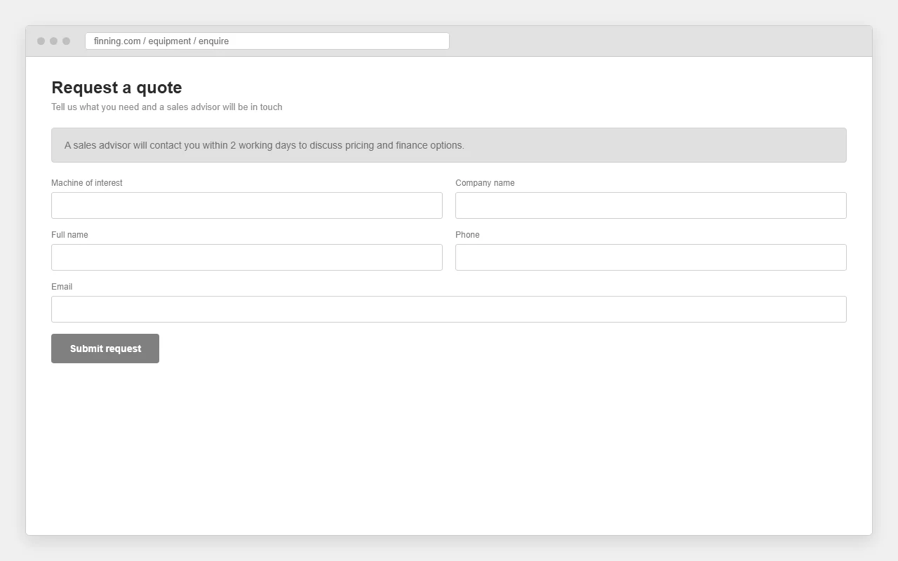
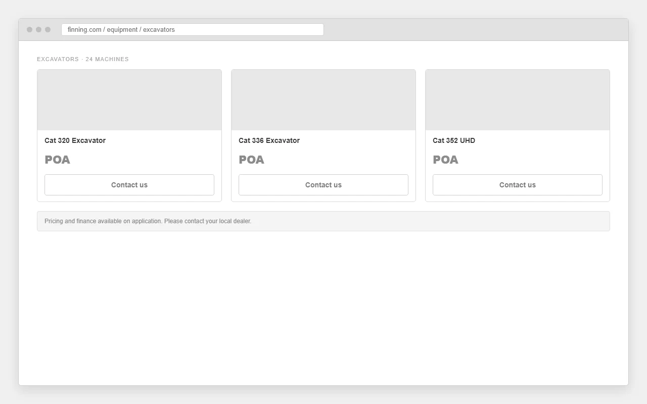
The brief was a self-serve dealer portal: let customers browse the equipment catalogue, understand a machine, and generate a transparent finance and repayment estimate on their own, then request a quote or callback to hand off to sales exactly when they were ready. My role was product discovery and UX across the catalogue, product detail, the finance calculator and the quote handoff. Engineering built against the flows that came out of the design work.
Buying a machine meant waiting on a person to tell you what it would cost.
Four problems tangled into one slow start. The core issue was not the catalogue, it was that the most important answer, what will this cost me per month, lived inside a sales conversation.
Getting a price and a repayment estimate required back-and-forth with a sales rep. The single thing most buyers wanted first was the thing the existing journey made them wait longest for.
Contractors and buyers who wanted to compare and budget before talking to anyone, and a sales team spending its time on early-stage questions instead of closing.
Equipment finance is genuinely complex, term, deposit, balloon, APR. Oversimplify it and the number is wrong; expose all of it and you overwhelm a buyer who just wants a ballpark.
An enterprise catalogue of machines, specs and variants that still had to be usable on a phone, often by someone standing on a job site, not sitting at a desk.
Understand what a buyer needs to know before they are ready to talk to sales.
A focused discovery loop: map the current sales-led journey, then learn which questions buyers want answered themselves and which finance variables actually drive the decision.
What does a buyer want to know on their own, before they are willing to start a conversation with a sales rep?
Which finance variables genuinely change the decision, and which can be sensible defaults so the calculator stays simple?
How much of this journey happens on a phone, and what has to survive being used on a job site?
What the journey told us
Mapping the sales-led process, the friction was front-loaded. Buyers stalled at the very start because they could not self-qualify, they had no way to see whether a machine was even in budget without booking a conversation. The finance question was not a late-stage detail; it was the gate to everything else. Make the repayment estimate self-serve, and the rest of the journey opens up.
"I don't want a sales pitch yet. I want to know roughly what it lands at per month, then I'll pick up the phone."Buyer interview
That set the design principle: answer the money question first, hand off to a human second. The calculator does the qualifying; the callback request is the bridge to sales, placed exactly where intent is highest.
Who's actually walking onto the lot?
The client brought a business brief: update the site, give desktop and mobile users more to work with, and make the platform an integrated lead engine for Caterpillar. A lead engine is only as good as its read on who it's selling to, so the first method was audience segmentation, straight from the brief.
The platform's one job
Everything downstream gets measured against that line. A prettier site that doesn't move leads is a fail. So I held two questions over every later decision: does this help a real buyer get to a real enquiry faster, and does it qualify them on the way?
Audience segmentation
The brief named the audiences. I split them into primary (the buyers the platform is built around) and secondary (real, but they convert differently). This is the frame personas and stories get built on top of.
Construction
Firms buying or hiring earthmoving and site kit. Spec-led, deadline-driven.
Industrial
Power systems and engines for plants and facilities. Uptime is the whole game.
Agriculture
Seasonal, weather-bound buyers. Need the right machine before the window shuts.
Rental services
Buying to rent out. Watching residual value and total cost, not just sticker price.
Freelance
Owner-operators and non-customers. Price-sensitive, can't buy outright, easily lost.
A brief names the audience. It doesn't tell you where the money leaks.
The brief is the start, not the answer. It told me who Finning sells to. It didn't tell me where those buyers quietly give up and ring a competitor instead. That's what the next three methods are for, competitor analysis to find the missing capability, personas to get inside the buyer, A/B testing to prove the fix.
My read: the win here isn't a redesign for its own sake. It's closing the specific gaps that send a ready buyer somewhere else.
01 BRIEF → AUDIENCE SEGMENTS
02 COMPETITORS → FIND THE GAP
03 PERSONAS → THE BUYER'S QUESTIONS
04 STORIES → WHAT TO BUILD
05 A/B → PROVE IT MOVES LEADS
JCB had one thing Finning didn't.
I benchmarked Finning against its main rivals, John Deere, JCB and Hyundai Construction Equipment. All three run a credible online presence with their kit on show. The analysis wasn't about copying them. It was about finding the one capability whose absence was actively costing leads.
Capability matrix
| Dealer | Product catalogue | Used equipment | Request a quote | Financing on platform |
|---|---|---|---|---|
| Finningbefore this project | Yes | Yes | Call only | Missing |
| JCB | Yes | Yes | Yes | Yes |
| John Deere | Yes | Yes | Yes | Partial |
| Hyundai CE | Yes | Limited | Yes | No |
GAP
JCB let you finance a machine on the site. Finning made you phone in for it.
That's the strength JCB held over Finning, a financing function in the interface. Every other box was roughly level. This one wasn't, and it sits right on top of the platform's one job: generating leads. A buyer who can't see the monthly cost picks up the phone to ask, or doesn't, and goes to the dealer who already showed them.
Where Finning is strong
Where it was leaking
Move the money conversation onto the page.
If a buyer can model a monthly payment before they ever speak to a human, the call they make is no longer "how much would this cost me?" It's "I want this one." That reframes the lead from a cold enquiry into a warm, qualified intent. That's the bet, and it's what the user stories in section 04 are built to deliver.
One competitor finding, sitting on the platform's one job. That's the thread the rest of the work pulls on.
▸ JOHN DEERE
▸ JCB // the finance gap
▸ HYUNDAI CONSTRUCTION EQ.
All three maintain a product-led web platform. JCB was the only one whose interface answered the financing question before the call.
Two buyers. Same catalogue, different fear.
Personas turn an audience segment into a person with needs, behaviour and motivation, so a screen has someone specific to answer to. I built two from the segmentation: the freelance owner-operator (the segment that leaks) and the fleet & procurement buyer (the segment that spends). Both end on the questions they actually ask.
Dele, the
self-employed operator
Rita, the fleet &
procurement manager
The questions both buyers walk in with
Personas earn their keep when they hand you a checklist. Here's the one this pair produced. Every later screen had to answer these, and the finance calculator answers the two that were costing the most leads.
From a sales-gated quote to a self-serve estimate, with the rep brought in at the right moment.
User stories turned the research into a build order, then A/B testing proved which version of the finance journey actually converted.
The finance calculator, written as requirements.
The competitor gap and the persona questions both pointed at one build: an on-platform finance calculator. Before any UI, I wrote it as user stories, so what we shipped traced back to a real need. The bet is simple. The calculator replaces the call where a buyer asks for a quote, so by the time they do call, it's to complete the hire or purchase.
As a customer I want to know my monthly price after down payment and interest so there are no surprises later.
As a customer I want to see how payment changes with customisations (attachments, parts, CVAs) so I'm pricing the machine I'll actually run.
As a customer I want the terms and conditions of financing visible so I can trust the number I'm looking at.
As a business we need to surface cash price, monthly price, monthly term(s), a down-payment input and a legal disclaimer on the calculator.
A control with no story is just decoration.
Writing the calculator as stories did two things. It kept the build honest, every field answers a stated need, and it gave the client a shared definition of done before a pixel moved. When a "nice to have" came up later, the test was easy: which story does it serve? If none, it didn't ship.
The reframe that matters: the calculator doesn't sell the machine, it qualifies the buyer. It turns a cold "what would this cost" call into a warm "I want this one" enquiry. That's the lead the brief asked for.
01 CASH PRICE
02 MONTHLY PRICE
03 MONTHLY TERM(S)
04 DOWN-PAYMENT INPUT
05 LEGAL DISCLAIMER
Twelve designs, built to be measured.
The client handed over unmoderated usability data: real users completing tasks with their screens recorded, showing the clicks and journeys they preferred. I read that as a map of where intent stalled, and turned it into 12 designs across desktop and mobile for A/B testing, each one a hypothesis with a metric attached.
What the unmoderated data told me
logged
Where users tapped, and where they hesitated. Hesitation is a design smell.
traced
The routes users actually preferred, not the ones the IA assumed they'd take.
recorded
Screen recordings of real attempts. You see the stall before they rage-quit.
Test matrix
| Experiment | Desktop | Mobile | Hypothesis | Measured by |
|---|---|---|---|---|
| Search functionalityfind a machine fast | D | M | Buyers with a model in mind want search, not menus. Make it the default path. | clicks to result |
| Nav bar redesignget oriented | D | M | Clearer categories cut dead-ends for buyers who browse without a target. | task completion |
| Product spotlightsurface the right kit | D | M | A focused spotlight lifts engagement over a flat grid of everything. | click-through |
| Reserve producthold it now | D | M | Mobile buyers want to reserve in the moment. Capture intent before it cools. | reservations |
| Finance calculatoranswer the money question | D | M | On-platform financing converts a "how much" call into a qualified lead. | qualified leads |
| Request a call backreach a human | D | M | A cleaner call-back ask lowers the bar to a high-intent enquiry. | enquiries |
Desktop track
Mobile track
Every method fed the next one.
The brief named the audience. Competitor analysis found the gap. Personas turned the gap into a buyer with questions. User stories turned the questions into a build. A/B testing is how that build earns its place in production instead of someone's opinion winning the room.
My read on this project: the leverage was never the visuals on their own. It was following one competitor finding all the way to a tested, qualified-lead machine. That's the work.
BRIEF
↓
COMPETITOR GAP
↓
PERSONAS
↓
USER STORIES
↓
A/B TESTING
The screens that let a buyer qualify a machine on their own.
Catalogue, product detail, and a finance calculator that answers the money question first, designed to work on the desk and on the job site.
New
UsedA buyer can now qualify a machine before sales ever picks up.
The intended shift was where qualification happens: move the money question to the front of the journey so buyers self-qualify, and let the sales team spend its time on warm, ready conversations instead of cold early-stage ones.
Expected outcomes
The calculator filters out price-shopping calls and warms the ones that come through.
Buyers self-serve the answers they used to chase, on the surface they prefer.
Cleaner hierarchy and mobile-first journeys widen who can actually use the platform.
Other Work
The rest of the work, from greenfield builds to systemic redesigns.