



Checkout and product discovery for one of the UK's largest online marketplaces, streamlining the path from basket to confirmed order across millions of listings.
OnBuy is one of the UK's largest online marketplaces, millions of listings from thousands of sellers, reaching millions of buyers. As the catalogue scaled, the journey from finding a product to confirming an order started to leak. Search returned overwhelming result sets, product pages buried the buyer-protection signals that earn trust on a marketplace, and a multi-step checkout shed conversions on mobile, where most of the traffic actually was.
My role was product discovery and UX: map where buyers hesitated and dropped, then redesign the discovery and basket-to-confirmation flow so the path was scannable, trustworthy and fast on a phone. I worked alongside a product manager and the engineering team, who built against the flows and requirements that came out of the design work.
Four problems tangled into one drop-off. None of them was a single broken screen. All of them were about what happens to a hesitant buyer between wanting something and paying for it.
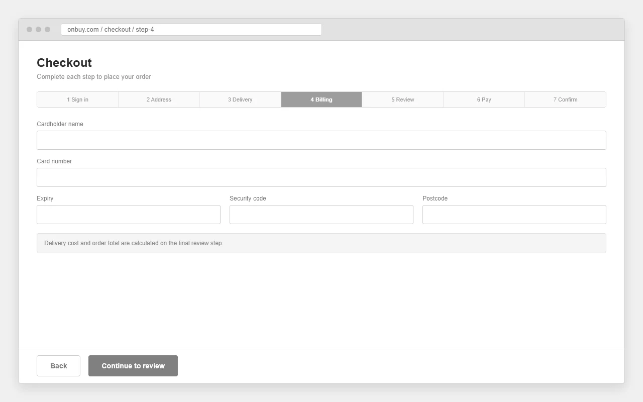
Checkout was a multi-step flow that asked too much, too early, and surfaced delivery and total cost too late. On mobile, where most buyers were, each extra step was another chance to abandon.
Buyers comparing across millions of listings, and the thousands of sellers who lost a sale every time a full basket was abandoned at the last step.
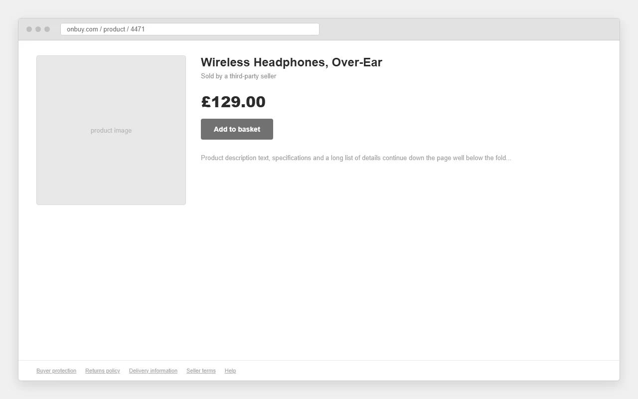
A marketplace earns the sale on trust. Buyer protection, returns and delivery promises existed but were buried below the fold, so the exact buyers who needed reassurance never saw it.
Discovery across millions of listings. Results had to stay scannable and filterable without overwhelming a buyer who only knew roughly what they wanted.
A focused discovery loop: an analytics and heuristic review to locate the drop-off, then usability sessions to understand the hesitation behind it.
Where in the basket-to-confirmation flow do buyers actually drop, and how much of that is concentrated on mobile?
Which trust signals, buyer protection, returns, delivery, seller rating, change a hesitant buyer's mind, and where do they need to appear?
How do you make a result set of millions of listings feel scannable instead of infinite?
Mapping the funnel, the steepest drop sat in the back half of checkout, not in discovery. Buyers were getting to the basket and stalling. In sessions, the pattern was consistent: people wanted the total cost, the delivery date and the safety net visible before they committed, not revealed one step at a time. Uncertainty, not price, was doing the damage.
"I'll add it to the basket, but if I can't see what delivery costs and whether I can send it back, I'll just go and check Amazon instead."Usability participant
That became the design principle for the flow: show the reasons to trust before you ask for the commitment. Cost, delivery and protection move up; steps come down.
The product team flagged that a percentage of users were dropping out of checkout. I ran a study on Userbrain, recording real users finding a product and trying to buy it, each leaving a rating and a comment. The first thing it settled: how people actually want to find things.
Users with a specific product in mind went straight to the search bar, not the menu. Search was the preferred path, and the comments backed it: "search works well for specific products". So search has to be fast, prominent and forgiving.
The opposite held when users had nothing specific in mind. They were happy navigating the menu and leaning on page filters to see everything available. So the menu and taxonomy still carry real weight, which is exactly what the card sort in section 04 is about.
I don't paraphrase user feedback into something tidier than it was. Here it is verbatim. Read together, the negatives cluster on two things: trust and friction. That clustering is the whole brief.
Trust. Users called the site "dubious" and "blank in places". The fear was looking like a scam, so they bailed.
Friction. Too many steps, repetitive fields, unclear delivery. Each one adds a reason to second-guess the purchase.
Retention. Even after a sale, OnBuy struggled to be remembered. A weak brand leaves no imprint to come back to.
The easy read was "too many steps, so cut steps". Userbrain said something sharper. Users weren't getting the cues they needed to believe this wasn't a scam: Trustpilot badges, secure-payment gateways, the company logo and a consistent colour scheme. It needed to look like a user hadn't left one site and gone to another just to pay.
My read: fix friction and trust together, but trust leads. A three-step checkout still fails if step two feels fraudulent. So the ranking was clear: trust first, friction second, with search-first journeys for known items and browse-and-filter for discovery.
The research split cleanly into two behaviours, the buyer who arrives knowing exactly what they want, and the buyer who's browsing for ideas. I built a persona for each. Different journeys, but the same thing makes them close the tab: a flicker of "is this site safe?"
Priya needs speed: a clean, short checkout that doesn't make her re-enter what she's already given. Marcus needs findability: a menu and filters built around shopper mental models, not OnBuy's internal structure. Both need trust: visible proof it's safe to pay. Without it, neither persona finishes, whatever else you fix. That is the shared design target the rest of the work aims at.
To fix abandonment you have to see it stage by stage. I mapped Priya's checkout journey against what she's thinking and where she stalls, then turned the recordings into a drop-off funnel. The biggest fall sits right at payment, the moment trust gets tested.
Fewer steps, no repeats. Working with the product owners, I cut the number of steps and stripped the "unnecessary" information the old flow demanded. Address and contact details stopped being asked twice. A quick buy started to feel quick again.
Make the pay screen feel like home. Carry the OnBuy logo, colours and Trustpilot badges all the way into payment, with visible secure-gateway cues. The brief in one line: a user should never feel they've left one site and landed on another just to pay.
Two moves shaped the redesign: make a catalogue of millions of products feel navigable, and win on trust at the exact moments a marketplace is most exposed.
Research showed browsers rely on the menu and filters, so the taxonomy had to match how shoppers group things, not how the business does. I ran a card sort on the top-level categories to surface where OnBuy's structure fought the user's. "Mobile navigation is confusing" was an IA problem before it was a UI one.
Participants sorted product cards into groups that made sense to them and named each group. Solid borders are placements people agreed on. Dashed amber cards are the ones that kept jumping groups, the friction points worth redesigning around.
Category trees are where everyone has a view and nobody has evidence. A card sort replaces the loudest opinion in the room with how actual shoppers group products. The movers are the gold, they tell you exactly which items need to live in two places instead of forcing a false single home.
This ties straight back to research: the browser persona lives in the menu. Fix the taxonomy and you fix the navigation complaint at its root. The output: four shopper-led clusters, four cross-category movers, and a flatter, dual-homed IA where filters do the tie-break.
OnBuy can't out-scale Amazon or eBay, and it doesn't need to. But in a market that competitive, looking less trustworthy is fatal, and users said the brand felt dated and dubious. I benchmarked the trust signals the big players use, then turned them into a rebrand brief aimed at one feeling: this is safe, and worth coming back to.
| Marketplace | Consistent brand to payment | Visible trust badges | Clear delivery info | Memorable identity |
|---|---|---|---|---|
| OnBuybefore rebrand | Breaks at pay | Underused | Unclear | Forgettable |
| Amazon | Seamless | Strong | Explicit | Iconic |
| eBay | Consistent | Buyer protection | Varies by seller | Established |
Continuity to payment: Logo, colours and layout carry unbroken into the pay screen, so users never feel handed off to a stranger. Proof badges: Trustpilot ratings and secure-gateway marks placed where doubt peaks, at details and payment. A bolder identity - A stronger colour palette and cleaner hierarchy so OnBuy reads as established, not "in its infancy".
Users abandoned as a precaution against identity theft. That's not a friction problem, it's a credibility problem, and a competitive market punishes it fast. After competitor analysis and best-practice research, the output was a new design system: a bolder brand palette, fresh components and clearer hierarchy, all aimed at trust and recognition.
Userbrain found the drop-off. Personas gave it two faces. The journey map and funnel pinned it to the payment step. The card sort fixed the navigation it surfaced. Competitor analysis turned "looks dubious" into a concrete trust brief. Every method answered a question the one before it asked.
My read on OnBuy: the trap was treating abandonment as a step-count problem. It was a trust problem wearing a friction costume. Cut steps and you help. Earn trust and you actually keep the sale.
Discovery, product detail and a condensed checkout, designed mobile-first and built to make trust visible at every step.


The clearest signal was behavioural: moving cost, delivery and buyer protection ahead of the commitment changed where buyers hesitated. The drop-off that had sat in the back half of checkout flattened once the flow stopped asking people to advance a step just to learn what they were agreeing to.
Fewer steps plus visible trust signals remove both reasons users were dropping at payment.
A memorable, trusted brand leaves an imprint, so shoppers come back instead of defaulting to Amazon.
The rest of the work, from greenfield builds to systemic redesigns.